🌸WEEK 3 (DES1204) + Grad Mag #3
- Teng

- Sep 4, 2018
- 1 min read
This week in portfolio class, we learned about layouts. We start with cutting out titles, subtitles and image from the newspapers to create our own layout. We decided to go for a simple layout with more pictures and lesser words, since majority of the people like to look at pictures more than words (pictures paint a thousand words) . Besides , we add subtitles in between the pictures so it can grab peoples attention and made a gap in between the photos so its not too much. Later, we learned about the importance of typography and layout. We were shown a few of the good and bad typography and layout, since this will determined whether you are a good or bad designer.

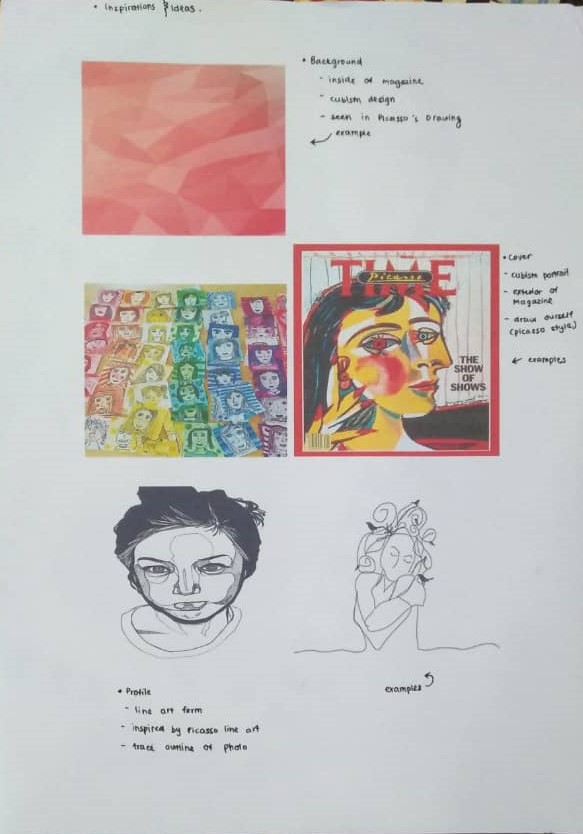
After our lecture, we discussed about Grad Mag. On the last update, we have chosen our theme. So, this week we started planning our cover pages, background, layout and profile. For our cover, we have decide our cover would be made up of faces drawn by themselves in Picasso's style. While on the inside of the magazine profile we decided to make each profile in the color of their choice while the layout is yet to be discussed since we have not made up our mind, but we would like to incorporate line art by Picasso's, so one of idea currently is to outline the photos of the profile picture. This is currently our progress, in the next update we will most probably plan out the fonts and story behind this theme.


Comments