Grad Mag #4
- Teng

- Sep 6, 2018
- 1 min read
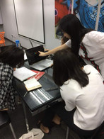
My group members and I meet up for a discussion on Grad Mag. The first thing that we discussed is about the fonts. For the cover, we decided to go for something simple yet classic such as the Georgia, Perpetua Tilting MT, Felix Tilting, Perpetua and Garamond fonts. While the fonts in the inside of the magazine is to be discuss. Besides, we also discussed about book binding, for our magazine we choose to use perfect binding to bind our book. The layout of the magazine have already been chosen too. We decided to put the self draw portrait on the left side of the magazine as the background. Moreover, since our theme is Picasso's + Pantone colors, on top of every pages we would explain about the colors and relate it to which painting of Picasso uses this specific colors. On our next meetup, we are going to make the background of the magazine with water colors or crayon, plan what to display during the idea pitch and design the introduction of the magazine ( the first two pages).


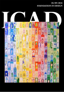
COVER LAYOUT ( AI)


Comments